[01]
MEN’S SKINCARE | IDENTITY & PACKAGING DESIGN
A skincare range that reads at a glance.
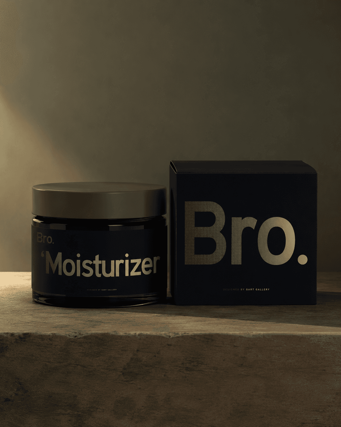
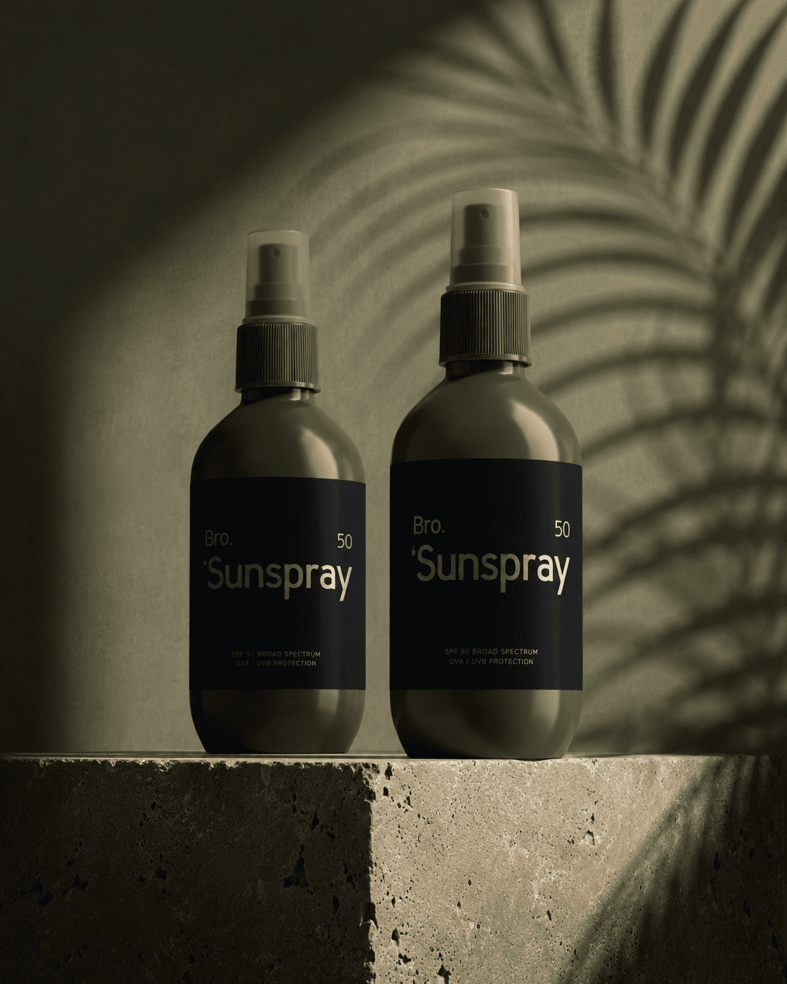
Bro. puts the product name where it cannot be missed. Suncream, serum, and sunstick packaging come in very different shapes, but QART built one visual system around oversized type, a compact brand signature, and clearly placed specifications. Each container keeps its own proportions without losing the look of the wider skincare range.
[02]
The Challenge
One label cannot fit every container.
A suncream jar offers a broad label; a serum bottle has a taller surface; a sunstick leaves very little room at all. Trying to force one fixed layout onto those shapes would make the product names harder to read or crowd the specifications. Bro. needed a flexible hierarchy, not a separate identity for each product. The concepts also carry functional information, including SPF 50 on the suncream and serum studies. That specification needs room alongside the large product name and the smaller Bro. signature. The typography establishes a reading order that stays familiar even as the package dimensions change.
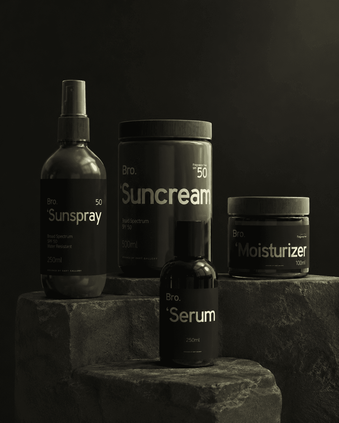
One bold type system across the range.
[03]
The Solution
Product name first. Details close behind.
The system makes the product word unusually prominent. 'Suncream' expands across the broad dark label of the jar. 'Serum' runs large on a taller bottle. The sunstick compresses the same direct naming approach into a smaller package. The Bro. signature and supporting specifications take secondary positions, which leaves the product type easy to find without relying on product imagery or complicated color coding. The olive-and-near-black palette creates a strong family resemblance in the mockups. The type system does the more important work: large product names, controlled spacing, and a consistent relationship between the brand, the variant, and smaller information. Packaging can be different in shape without becoming different in identity. The SPF 50 marking is visible on the sunscreen concept and serum packaging studies, but stays subordinate to the large product name. That ordering helps a shopper identify the item first and then scan its specifications.
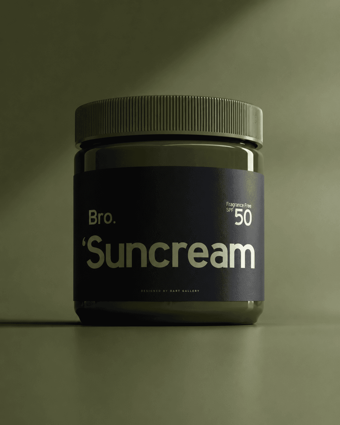
Bro. Suncream SPF 50, front and center.
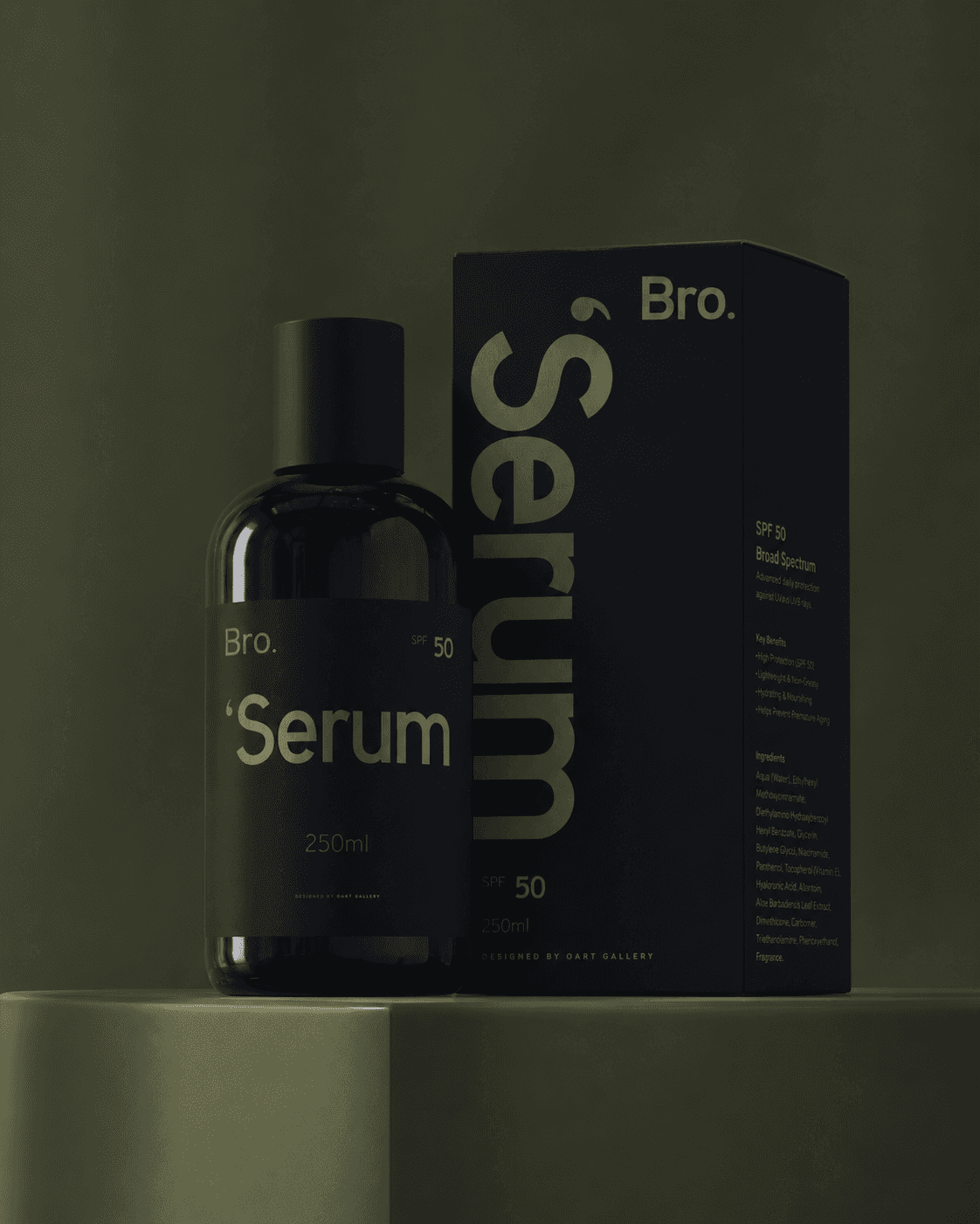
The serum name takes up the space.
[04]
The Process
The smallest package sets the limit.
The format studies reveal the logic of the system. The suncream jar has space to make its name the main graphic event. The serum bottle uses the same idea vertically, while its carton holds a larger volume of supporting information. The compact sunstick gives the design its toughest real estate constraint. By working across these surfaces, the identity establishes what stays recognizable even as the label proportions change. Product names maintain their priority, Bro. retains a consistent signature, and specifications fit around the headline rather than competing with it. Viewed together, the set feels like a product family because the viewer knows where to look on each package. The sunstick shows the most demanding version of that hierarchy. The same visual system needs to fit its smaller surface without shrinking the name into obscurity. The jar and bottle give the type more room, while the Bro. signature keeps the products visibly connected.
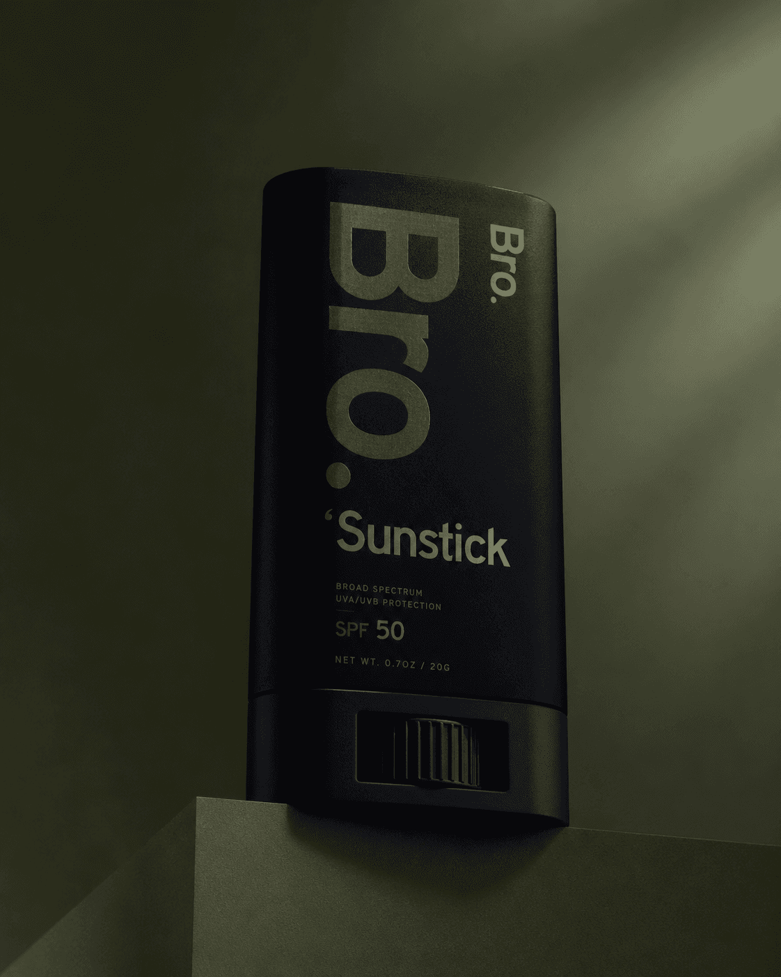
Compact sunstick. Full Bro. identity.