[01]
VIETNAMESE BEVERAGE BRAND | BOTTLE & GIFT PACKAGING
The gift begins before the bottle is opened.
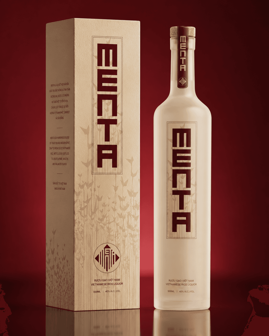
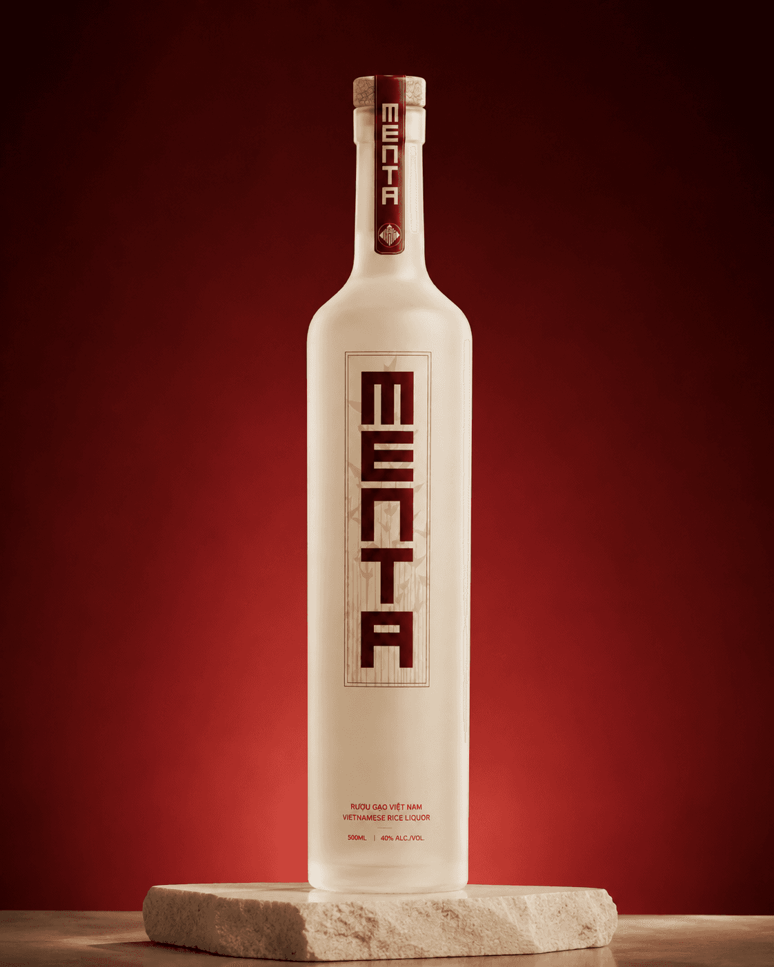
Menta's Vietnamese rice liquor packaging unfolds in stages: gift bag, box, bottle, and neck seal. QART gave each a different role while keeping the same cream-and-deep-red identity. Tall lettering makes the Menta name immediately recognizable, while botanical illustrations and a circular emblem become more prominent on the larger gift surfaces. It is a packaging system designed for the experience of giving, not just for the shelf.
[02]
The Challenge
The bottle is not the first thing people see.
A bottle has to work on a shelf or dining table, where the brand name, product details, and overall silhouette compete for attention. A gift box does something different: it sets an expectation before the product comes into view. The paper bag is often the first part anyone sees, sometimes from across a room. For Menta, these were not independent packaging assignments. The project brings together the bottle, neck treatment, label, box, and bag as one presentation. Vietnamese references mattered, but the identity also needed to feel contemporary and deliberate. There was a risk of letting decorative cultural motifs crowd the packaging or repeating the same label unchanged on every surface. A more convincing system would give each element a role while keeping the whole set unmistakably connected.
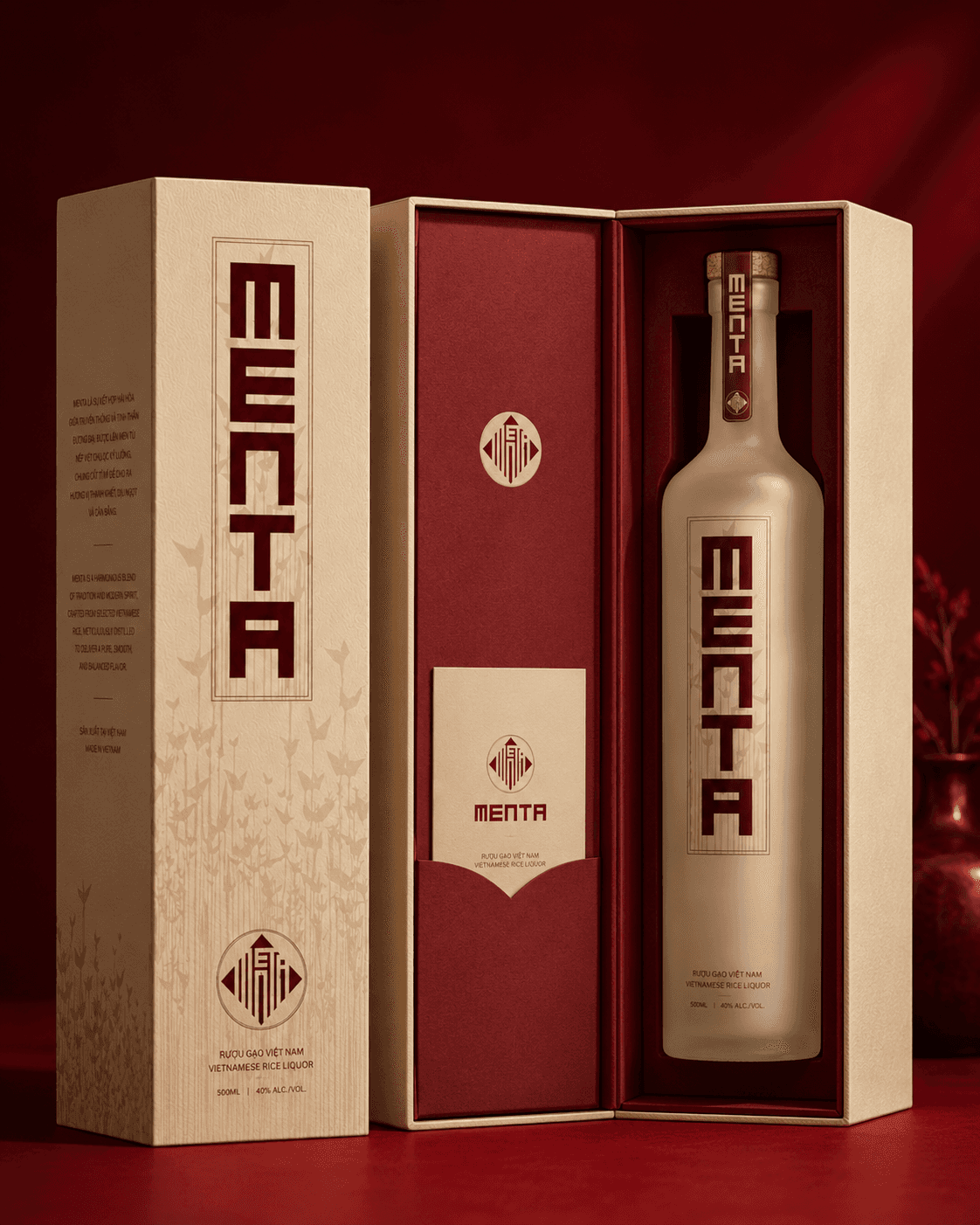
One bold wordmark across bottle and box.
[03]
The Solution
One identity across bag, box, and bottle.
The bottle establishes the rhythm. Its pale surface creates room for a deep red, vertically oriented Menta wordmark. Smaller product information remains below, while the long neck gives the name another place to appear through a red seal. The result is a silhouette that feels continuous from cap to body. The presentation box takes advantage of its broad flat face to make the vertical wordmark even more prominent. The paper bag shifts the emphasis toward a circular secondary emblem and a field of fine botanical forms. That pattern is present across the family but never needs to occupy the same amount of space. The cream-and-red palette holds everything together, from the tight neck seal to the full gift presentation. Typography carries most of the identity, with geometric, Nôm-inspired references in the creative direction. The work uses these cultural cues as part of a contemporary packaging composition rather than requiring the viewer to recognize a specific historical character.
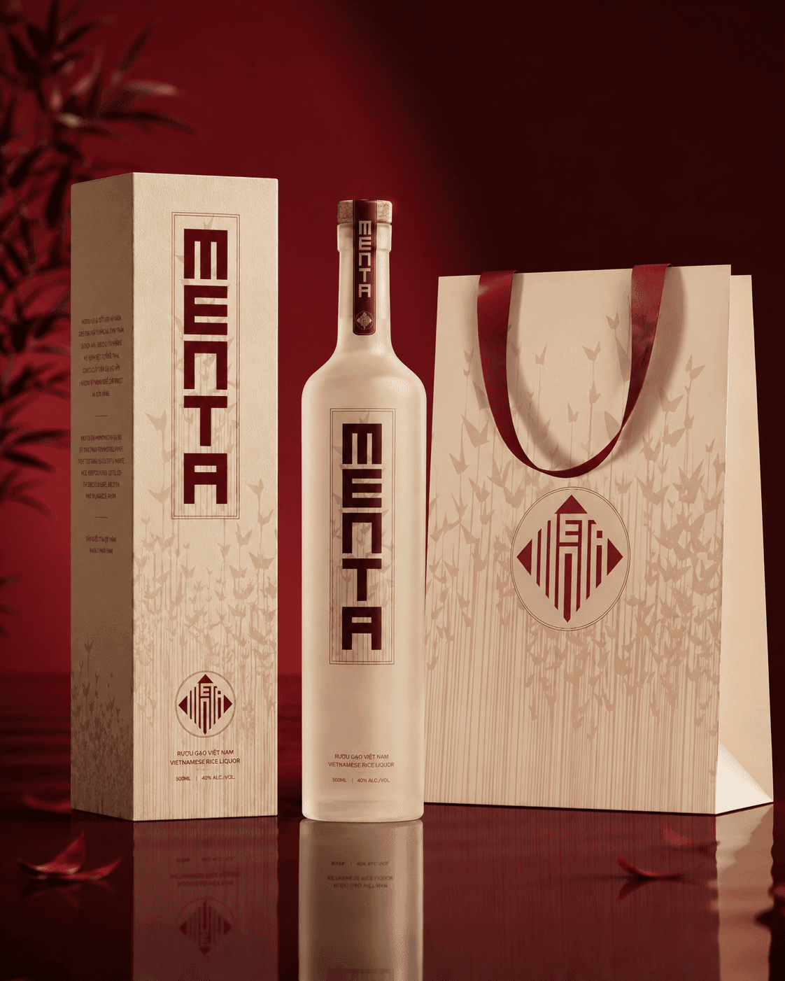
Gift-ready: bottle, box, and bag.
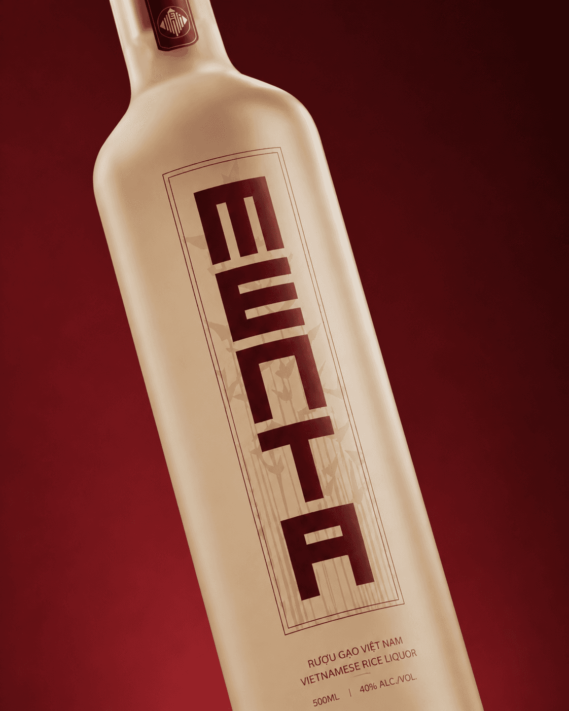
Menta's red lettering takes the lead.
[04]
The Process
From gift bag to bottle neck.
The packaging studies are best read as a sequence. Start with the paper bag: its large patterned surface and emblem announce the brand without needing to reproduce the bottle label. Move to the box, where the vertical name becomes the main gesture. Take out the bottle, and that same tall lettering now fits the proportions of the glass. Look closer at the neck seal, and the mark becomes a small, carefully positioned detail. The design changes scale with each object, but the cues remain familiar. Red lettering, cream surfaces, restrained borders, and botanical textures keep the gift set visually related. The bottle can stay visually restrained because the box and bag give the illustrations more space. Each piece introduces a different part of the identity. The bag makes the pattern and secondary emblem visible at a distance; the box gives the vertical name more space; the bottle pares the composition back to the essentials. Even the neck seal carries a recognizable detail for someone holding the finished gift.
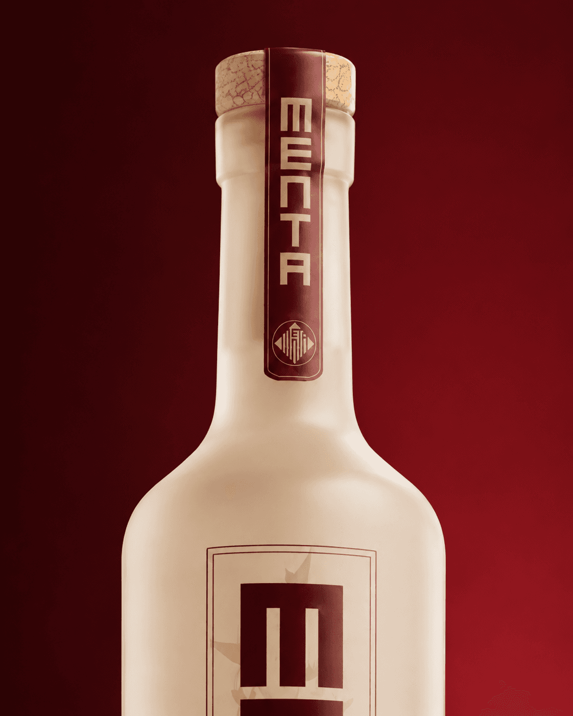
The branding reaches the neck seal.