[01]
Brand Identity
A real estate identity built on trust and direction.
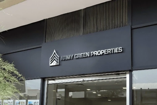
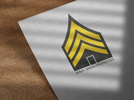
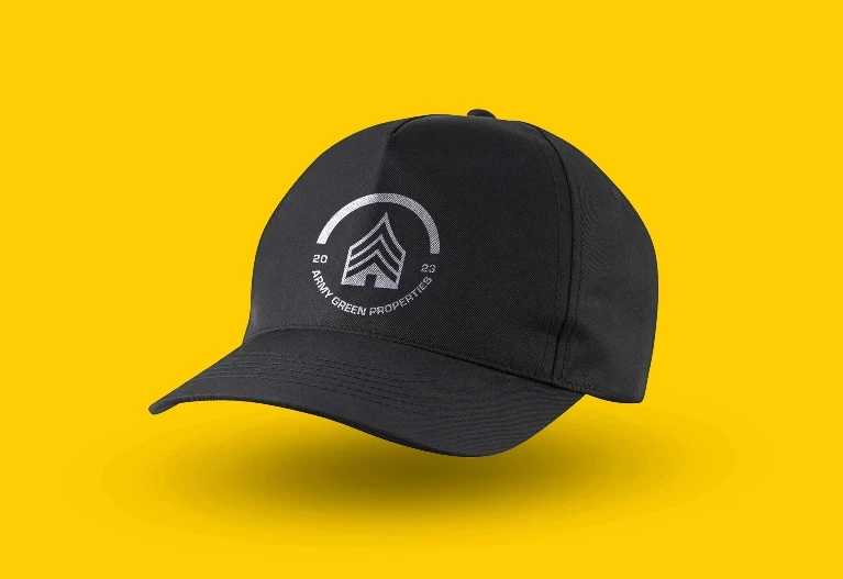
QART created a brand identity for Army Green Properties that connects the founder's military background with the clarity and reassurance people expect from a residential real estate company. A chevron and house form anchor a practical system for signs, stationery, apparel, and local advertising.
[02]
The Challenge
Express discipline and reliability without making the brand feel severe.
The identity needed to respect the founder's background while remaining approachable to people making personal decisions about buying, selling, or renting a home.
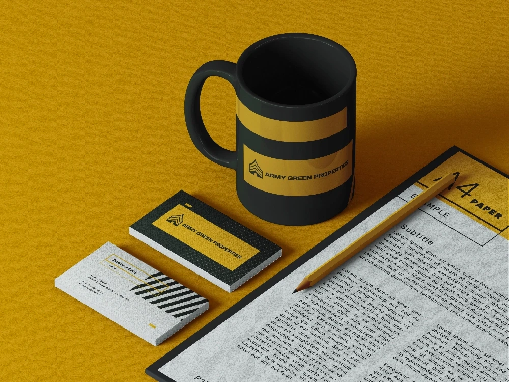
Everyday Brand Essentials
[03]
The Solution
A forward-facing mark built from a chevron and house.
The symbol combines direction, structure, and shelter in one simple form. A restrained palette and clear typography make the identity easy to apply and recognize.
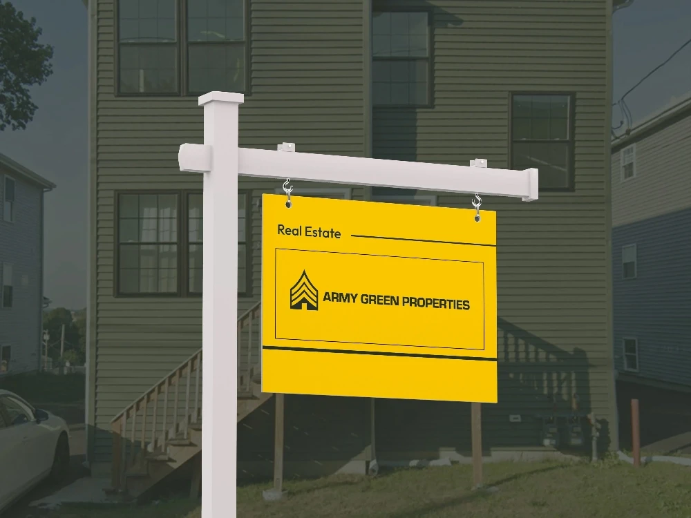
A Sign People Can Recognize
The Brand in the Community
[04]
The Process
Turn the founder's values into a usable everyday system.
QART developed the mark, typography, and applications together, testing the identity on the touchpoints most visible in residential real estate.
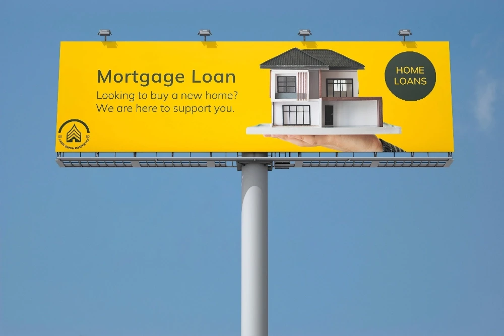
Built for Local Visibility