[01]
COMMUNITY SOCCER | CLUB CREST DESIGN
Every team deserves a crest of its own.
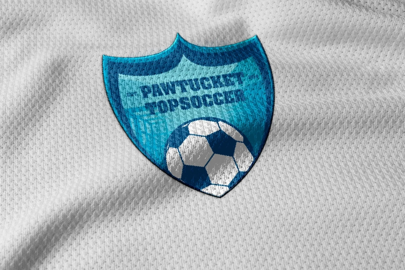
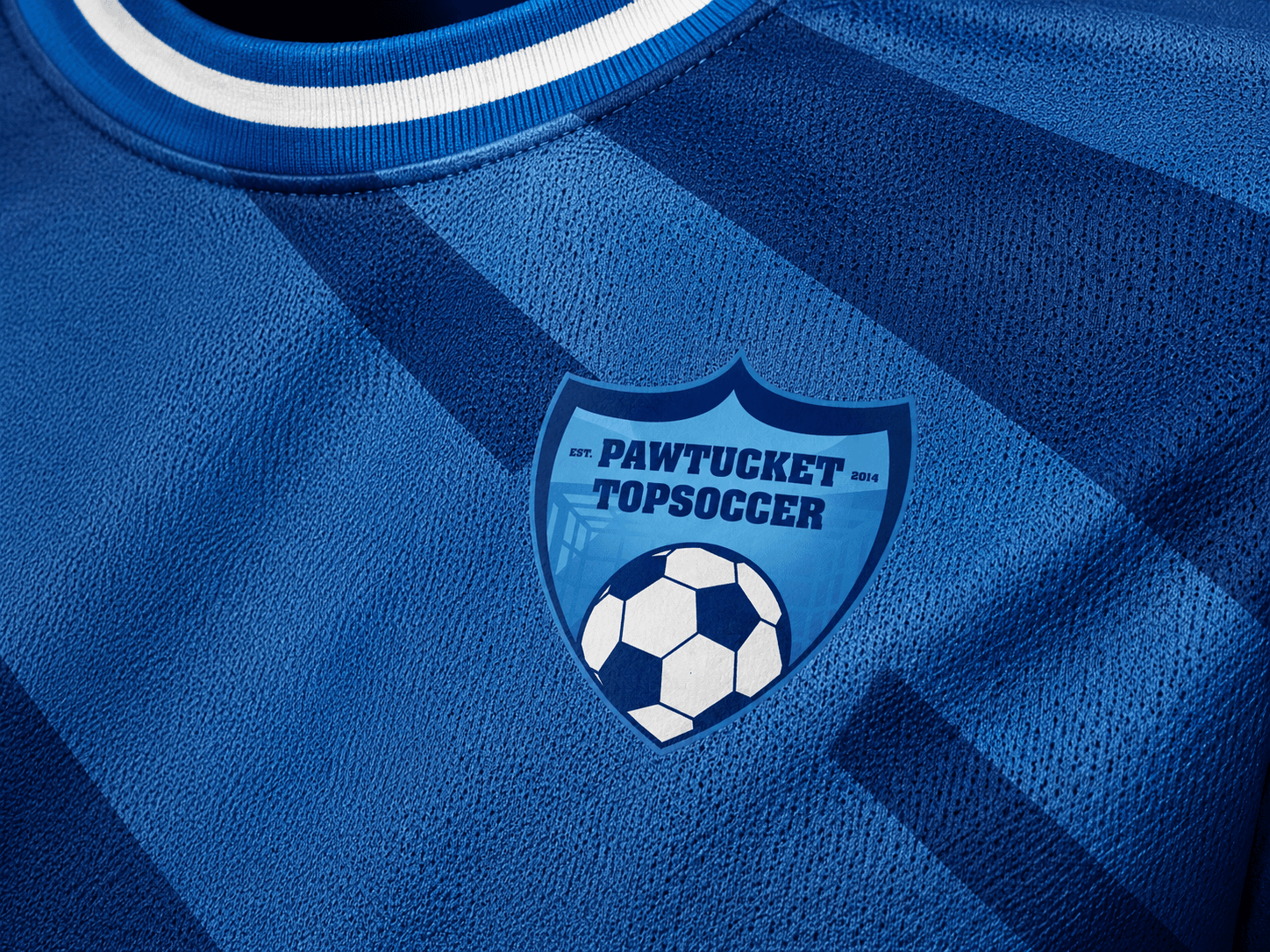
Pawtucket TOPSoccer is an inclusive youth soccer program. QART designed a club-style crest with a ball, shield, local name, and bold blue colors, then applied it to a field banner, water bottle, and equipment bag. The identity uses familiar soccer graphics to give the program a recognizable presence on the field and on the gear players carry.
[02]
The Challenge
Make it feel like a soccer club.
A field banner is read from a distance. A water bottle is seen up close. An equipment bag is surrounded by other gear. Pawtucket TOPSoccer needed a clear local identity that could work in all three settings while still looking unmistakably like a soccer team. An inclusive program can easily be represented by graphics that emphasize its mission while barely acknowledging the sport itself. QART's approach put soccer at the center. The emblem needed the familiar confidence of a club badge, a clear local identity, and enough simplicity to work on the kinds of materials a community team can actually use. The ambition was straightforward: give the program something its players could feel was theirs.
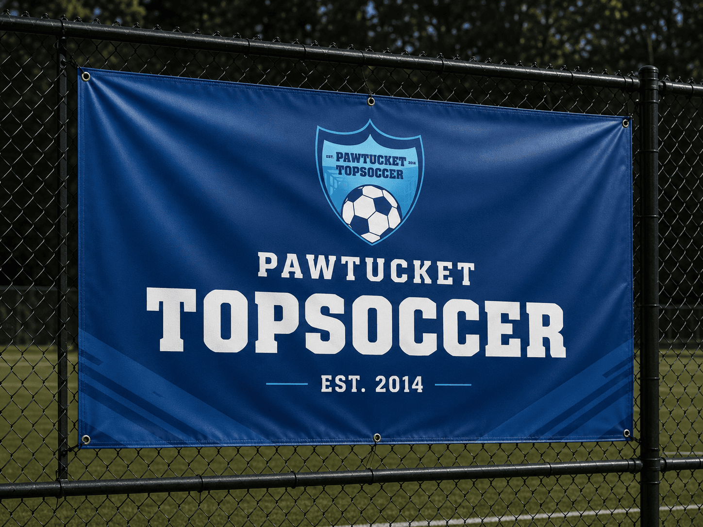
Pawtucket TOPSoccer on the touchline.
[03]
The Solution
A Pawtucket crest, ready for the field.
The crest uses the recognizable outline of a shield with a soccer ball inside. Pawtucket identifies the team's home, while the TOPSoccer lettering carries the program name. The blue palette links the crest with the banner, bottle, and equipment bag shown in the identity studies. The design deliberately works in the visual vocabulary of soccer clubs. A shield has a history in the sport; the ball leaves no ambiguity about the activity. That recognizability makes the system useful before anyone reads a paragraph explaining the program. On the large banner, the full team name carries the message from a distance. On a water bottle, vertical lettering takes over and the crest becomes a smaller companion. On the equipment bag, the mark and larger word combine again. The result looks at home on soccer equipment and field graphics, not only in a presentation of the crest.
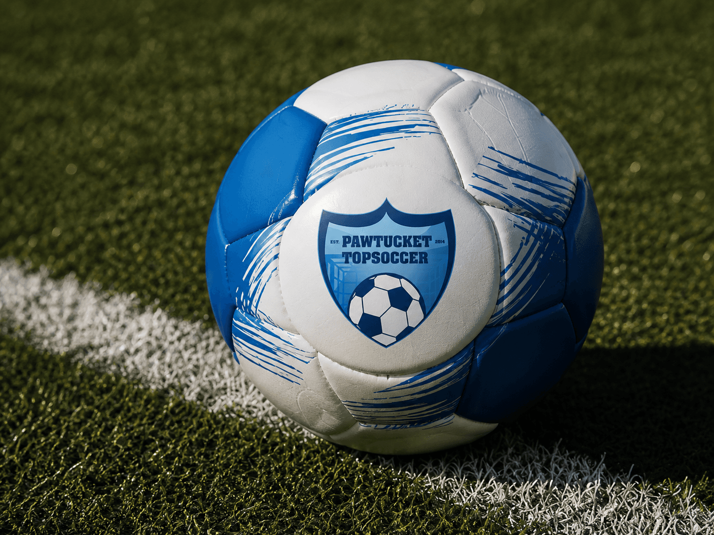
Soccer stays at the center.
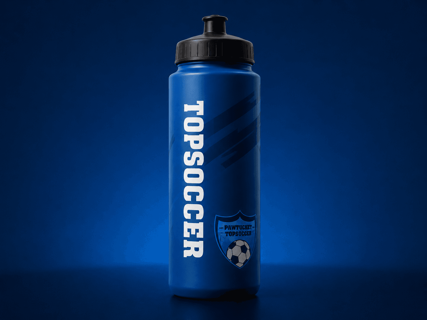
Club identity on a water bottle.
[04]
The Process
From sideline banner to equipment bag.
The case study follows the mark onto objects that belong to the rhythm of a soccer program. A field-side banner makes the team name unmistakable against the blue background. A ball and field image puts the identity in its sporting context. The water bottle shows how the wordmark can become the dominant element on a tall surface; the equipment bag uses the crest as a badge beside larger team lettering. None of these applications requires a complicated secondary illustration. The same few elements can be arranged according to the available space while preserving the team's visual identity. That is useful for a community program that might need event graphics one day and team gear the next. The applications use different parts of the same system. The banner leads with the full name and crest, the bottle gives TOPSoccer lettering the largest role, and the bag pairs that name with the smaller badge. Each format stays recognizable without needing a new logo treatment.
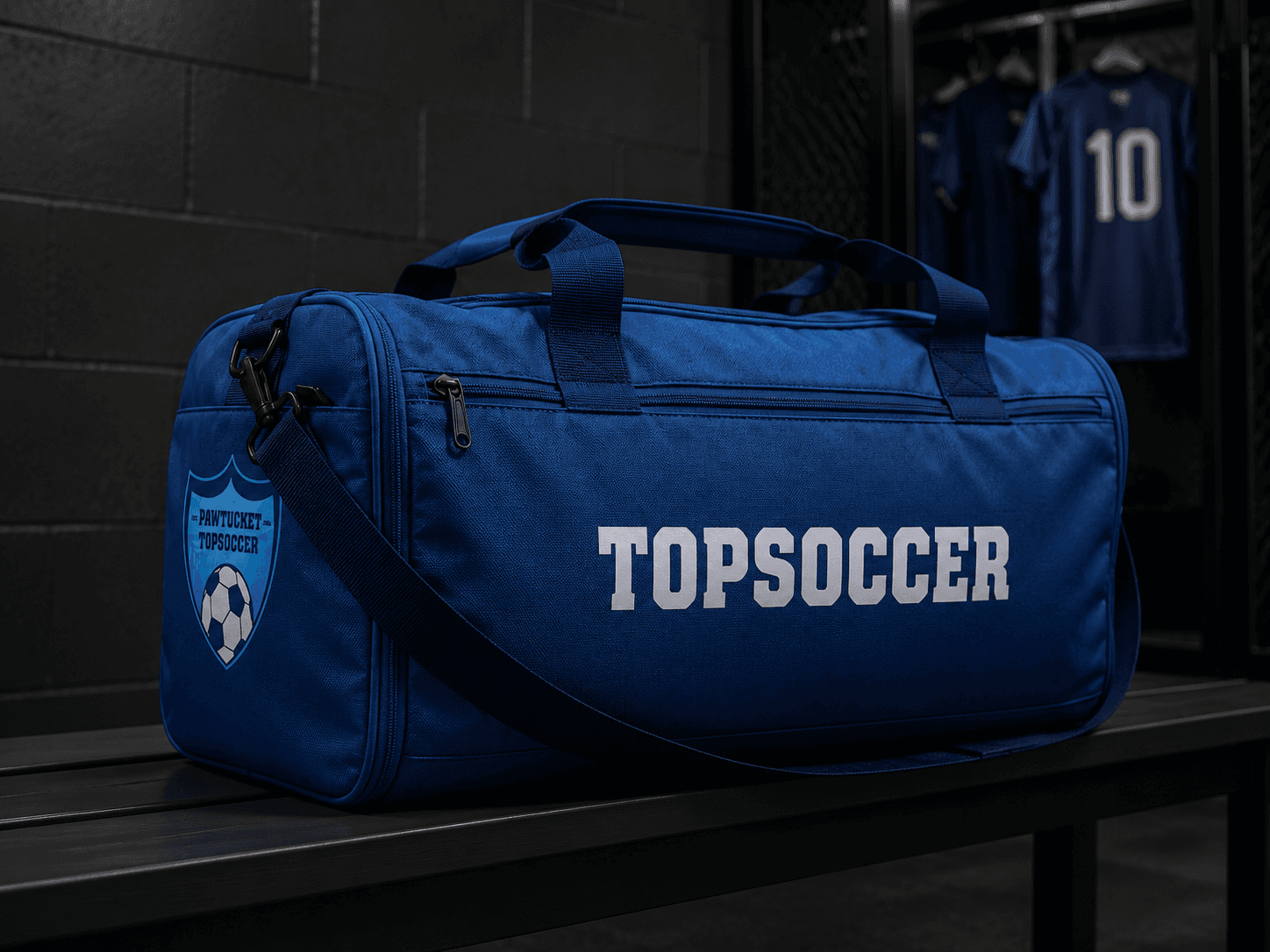
TOPSoccer lettering on everyday gear.