[01]
Logo Design and Club Identity
An inclusive club badge made for the field.
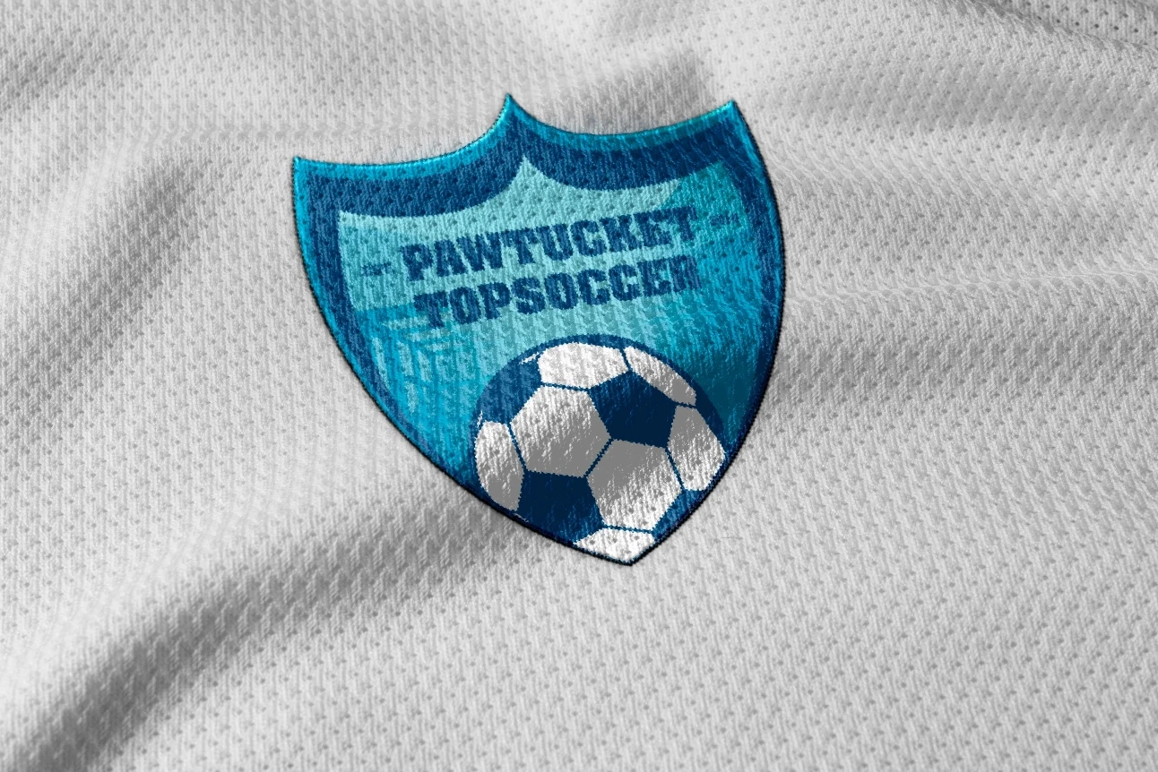
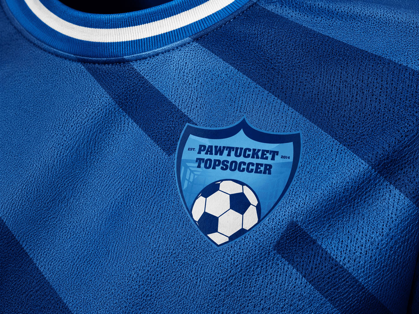
QART designed a new identity for Pawtucket TOPSoccer, an inclusive youth soccer program. The crest gives players and families a recognizable team symbol that works across jerseys, banners, events, and digital communication.
[02]
The Challenge
Create a welcoming identity that still feels like a real team.
The mark needed to feel energetic and credible on the field while staying friendly, clear, and easy to reproduce for a community program.
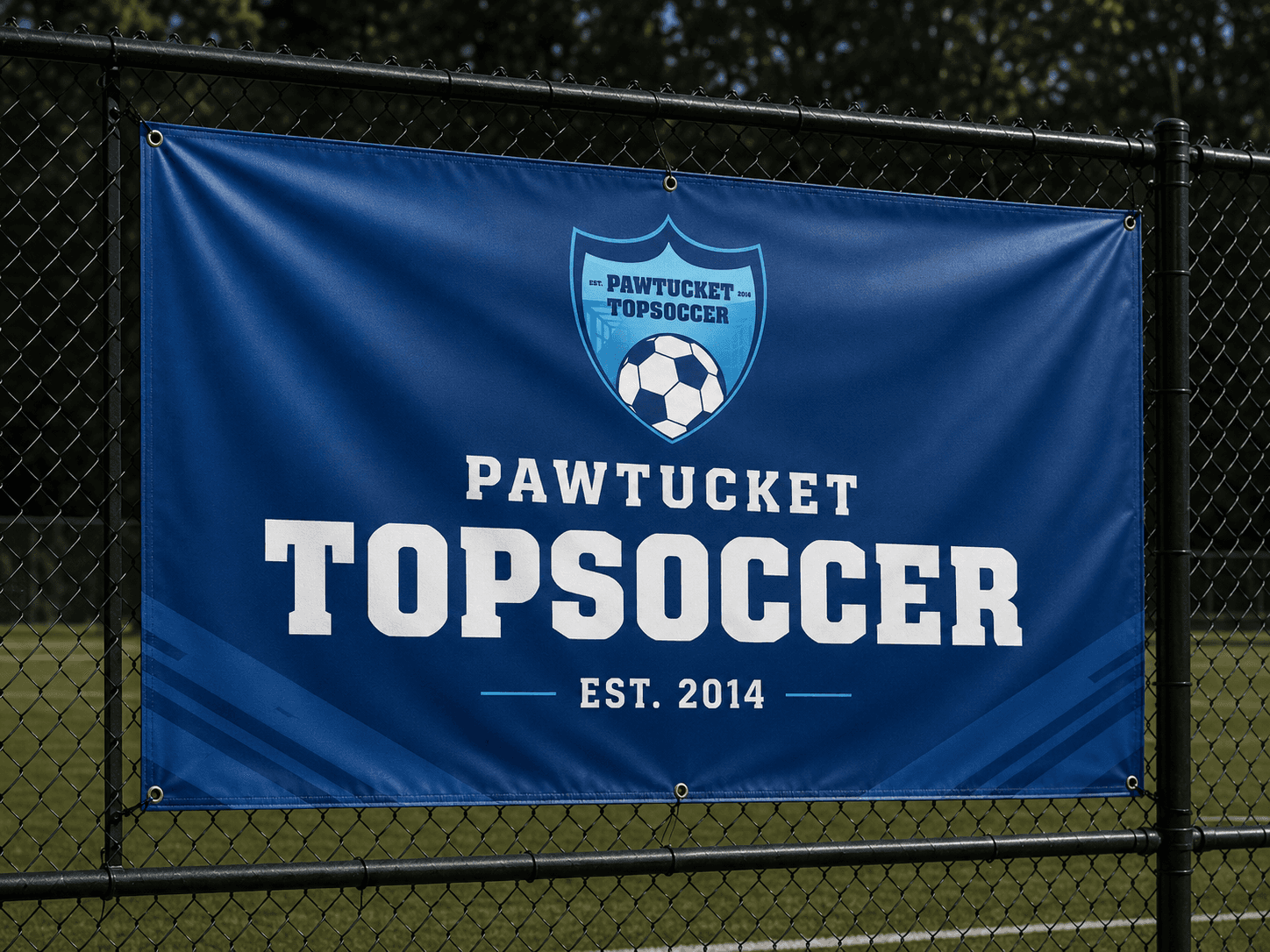
A Team Starts Here
[03]
The Solution
A simple shield built around movement and belonging.
A dynamic soccer ball sits inside a clean crest, giving the program an active and approachable symbol. The structure scales easily across uniforms and community materials.
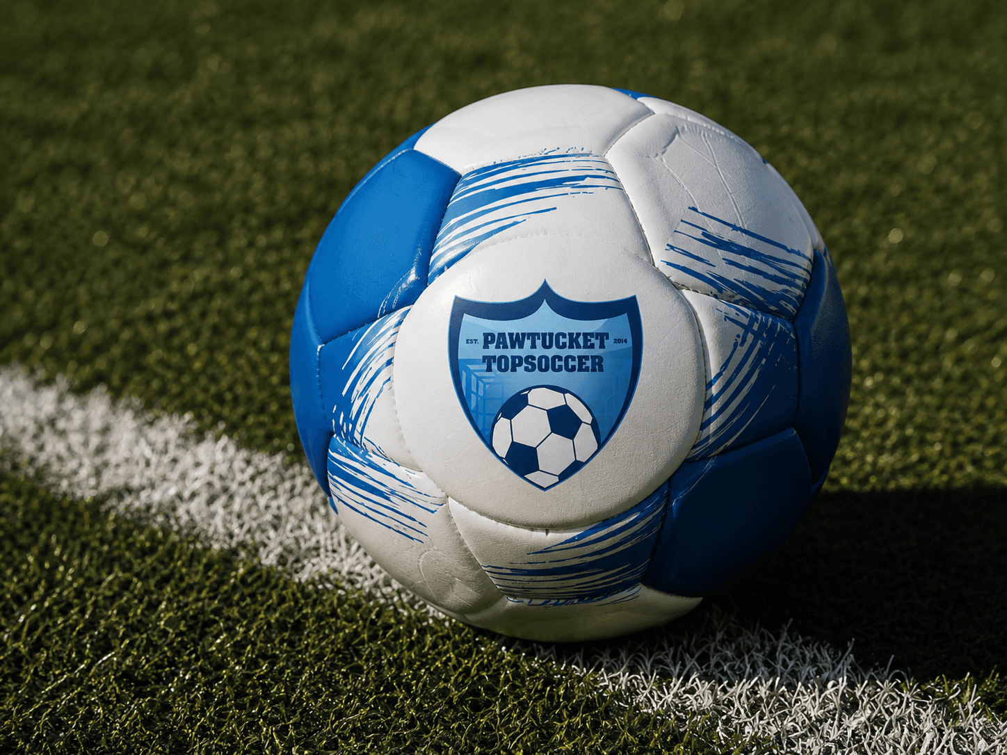
Made for the Field
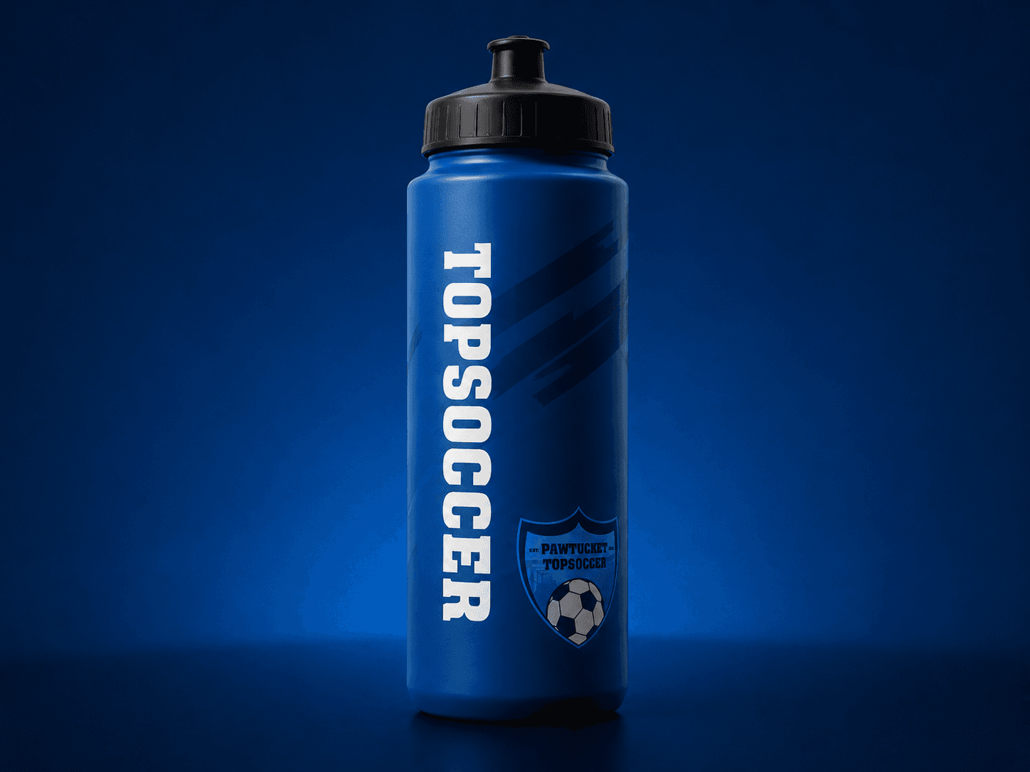
A Club People Can Recognize
[04]
The Process
Start with the signals that make players feel part of a team.
QART combined the crest, ball, city name, and team colors into a compact system, then refined it for small-scale clarity and practical use.
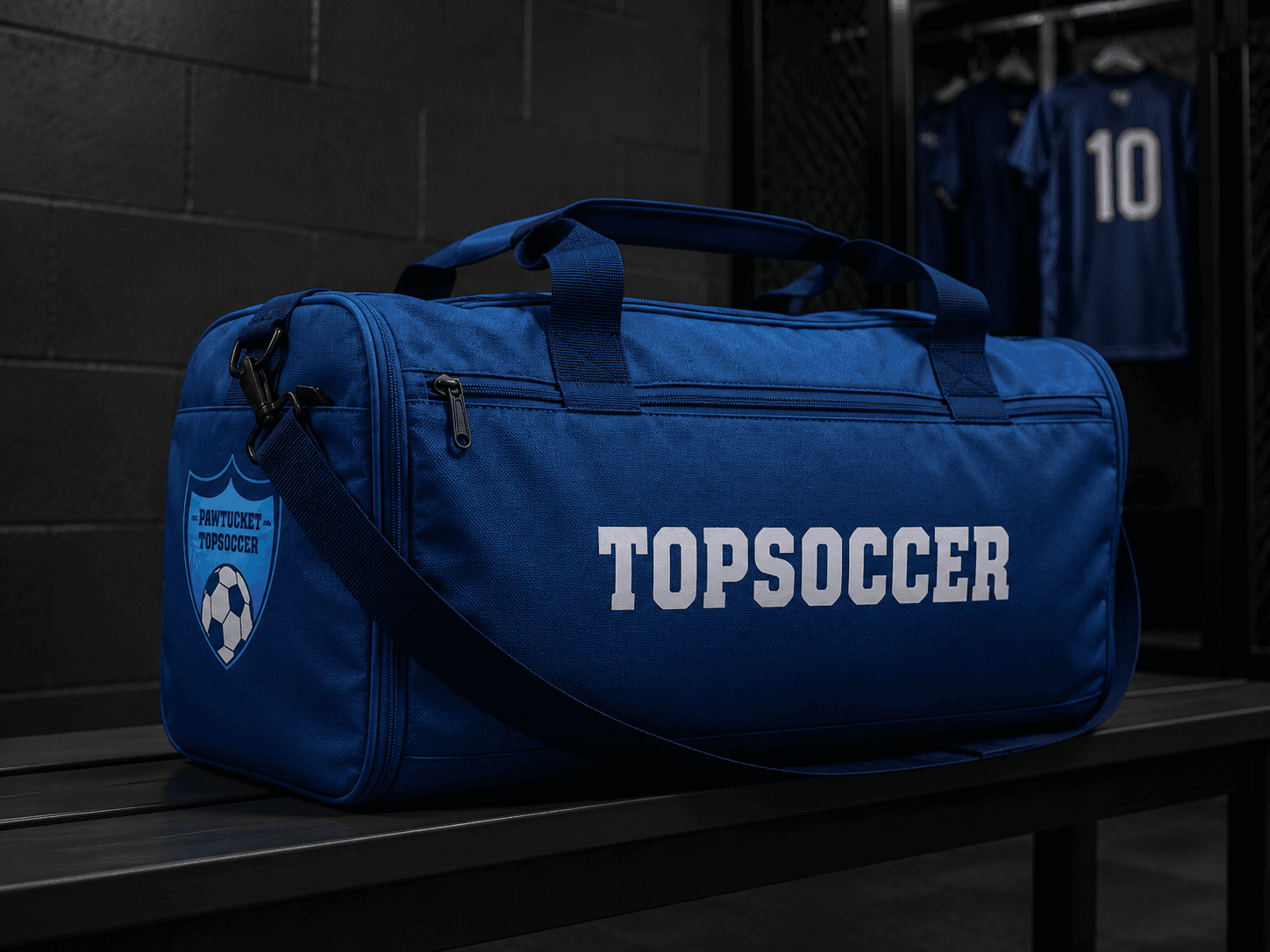
One Badge, Many Moments