[01]
Brand Identity and Packaging
A clear skincare identity built around SPF.
QART developed Bro. as a direct, modern men's skincare brand, starting with sun protection and expanding the system across serum, moisturizer, sun cream, sun spray, and portable formats. The packaging makes each product easy to identify while keeping the range visually consistent.
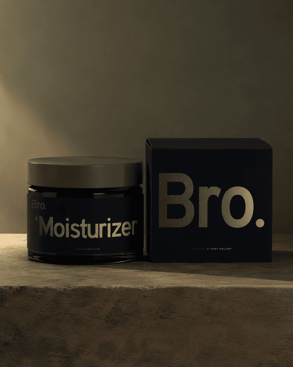
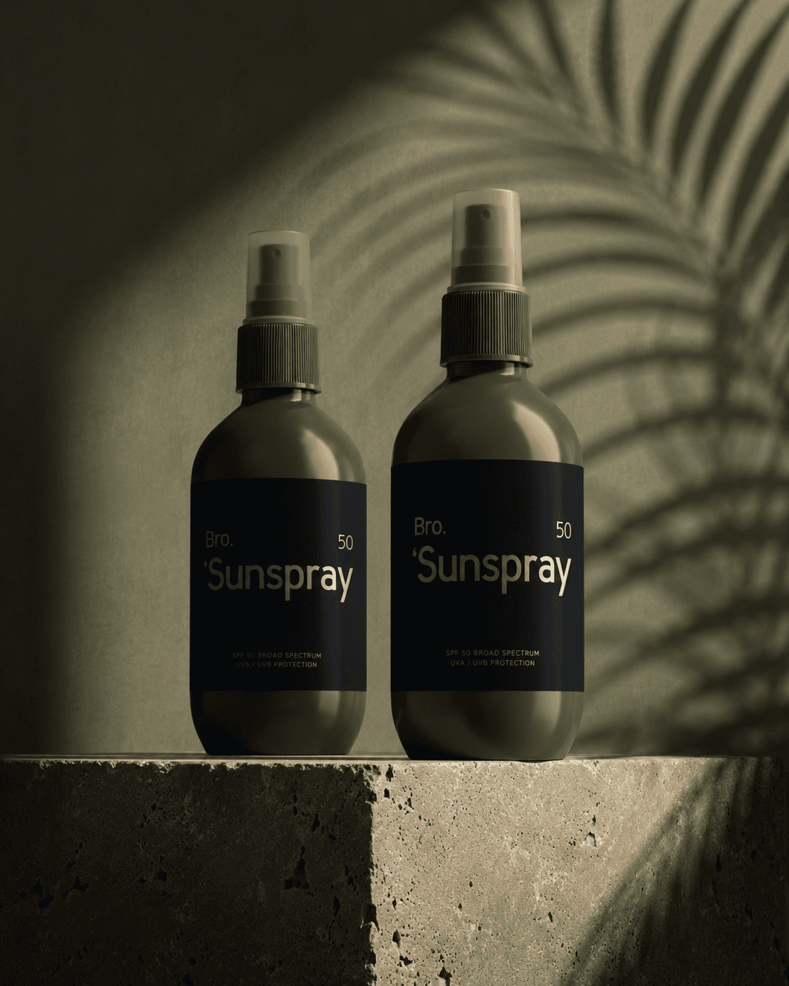
[02]
The Challenge
Expand one SPF idea into a complete product family.
The brand needed to make men's skincare feel approachable and easy to understand, while creating enough structure for multiple formulas and package formats.
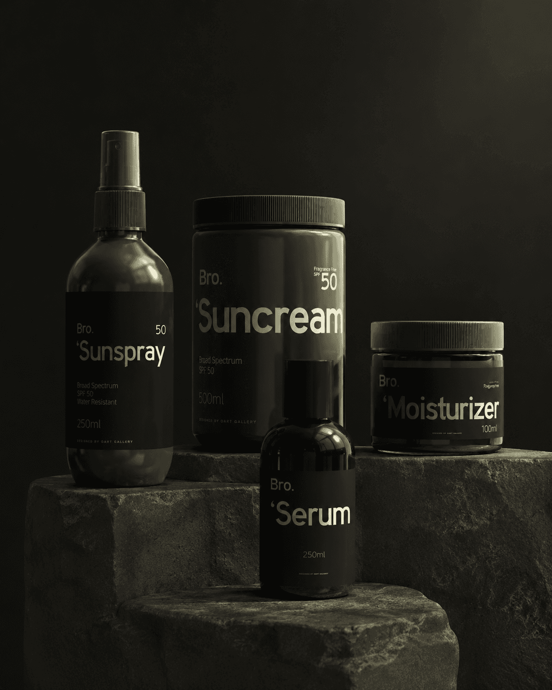
The Everyday Routine
[03]
The Solution
One visual hierarchy across the full routine.
Direct product names, high-contrast typography, and a consistent label structure make the range easy to scan. Each container feels distinct, but clearly belongs to the same system.
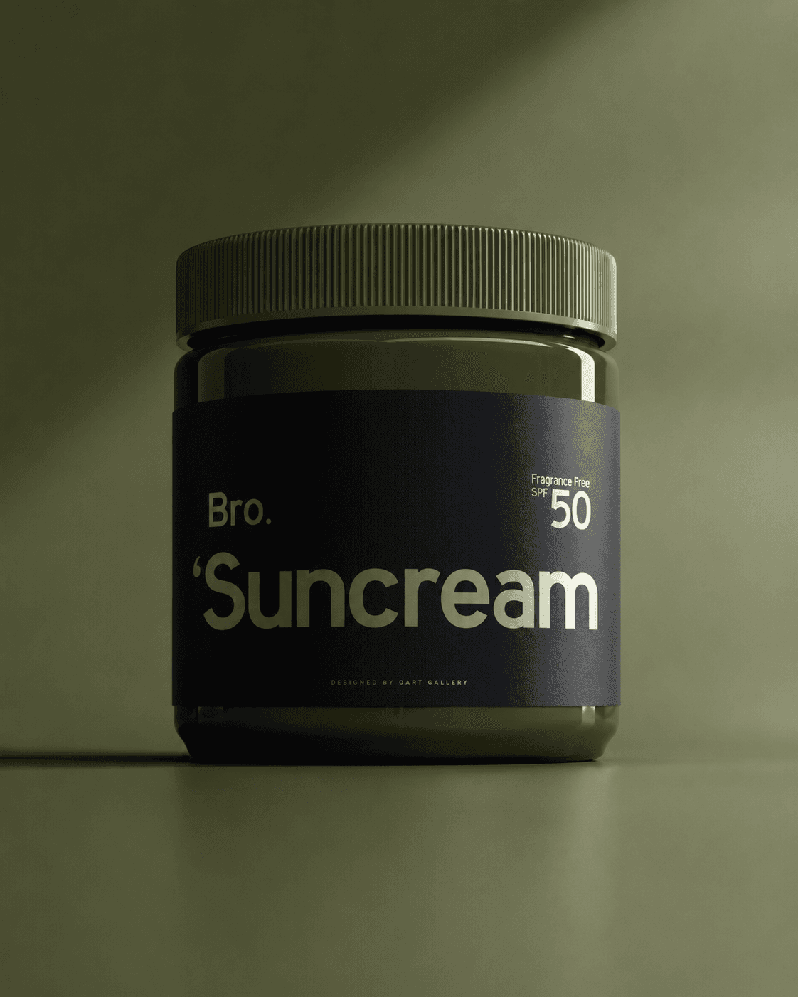
SPF, Made Clear
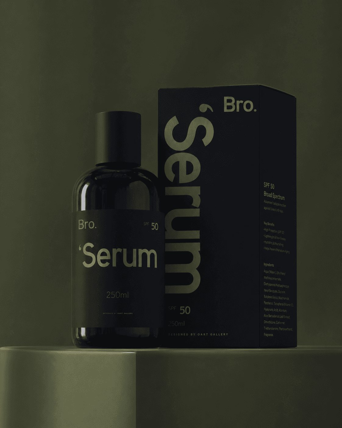
One System Across the Range
[04]
The Process
Design around how people choose and use the products.
QART mapped the key information on each format, developed the packaging hierarchy, and tested the identity across bottles, jars, sticks, and boxes.
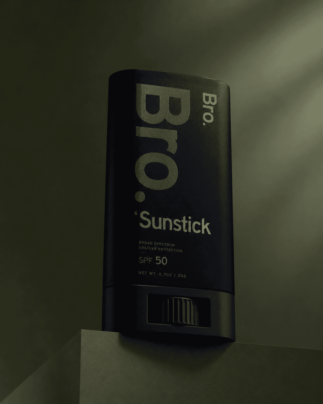
Care on the Go